Edugreat System

objective
The challenges of online and hybrid education became blatantly more apparent with the changes implemented because of the COVID-19 pandemic. There are few online platforms that allow educators to effectively collaborate with their peers on educational materials and organize them. There is a need to integrate multiple apps and resources into one platform for easier access and utilization. Streamlining teachers’ tools and encouraging them to share resources will allow them to apply a more personalized approach to educating students with diverse needs and abilities. Based on preliminary competitive analysis and literature review, it became apparent that there was a number of opportunities for improvement in this space. The EduGREAT digital collaborative toolkit is the culmination of our efforts to design a system for educators which aims to address and mitigate the major challenges they have faced during the past year.
Context:
MS HCI Capstone Project: DePaul University
Teammates:
Krista Kleban, Michelle Novak, and Miguel Rodriguez
METHODS & TOOLS:
Competitive Review, User Interviews, Mural, Card Sorting, Wireframing, Prototyping (Figma), Remote Usability Testing
Role:
Interviewer, researcher, UX/UI designer
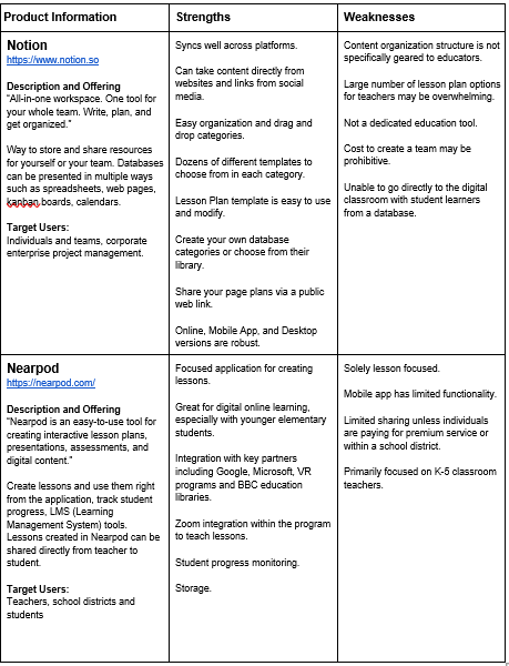
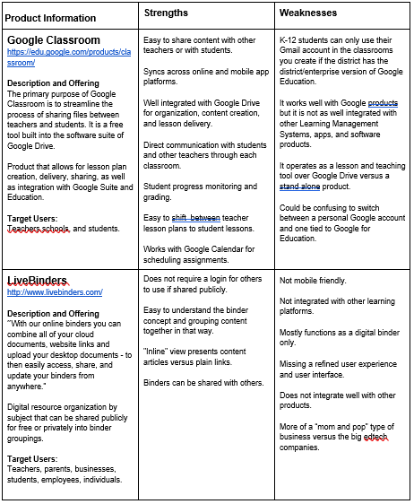
competitive Review [DIScover]
To being our initial discovery phase, the team conducted a thorough competitive analysis in the problem space. This helped us gain a better understanding of the market by evaluating competitors’ products in the online learning space that support remote educators. Identify the strengths and weaknesses of each product to determine areas of opportunity that we can apply to our product. After reviewing over a dozen potential competitor products in the market, we chose to analyze four that include useful features for a digital teacher toolkit:


remote User Interviews [Discover]
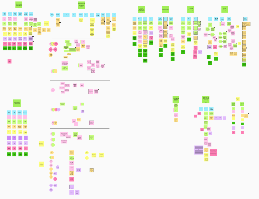
We conducted in-depth remote interviews through Zoom with 7 current K-12 teachers to determine remote education tools, goals, challenges, and potential recommendations for improvement. Interview findings were used to develop design implications and shape the product direction. Following transcription of each interview, the team created a shared affinity diagram in Mural to synthesize and organize findings into three main focus categories:
1) Collaboration
2) Remote Teaching (Methods & Challenges)
3) Lesson Planning & Resources
USer Archetypes & Journey map [define]
Following the creation of the affinity diagram, the team used interview participant characteristics to develop user spectrums, and inform the creation of two user archetypes. Additionally, the team created a journey map based on the information gathered in user interviews, which helped the team understand the user mental model and prioritize user pain points and areas of opportunity when developing the system.


Crazy 8’s Sketching [ideate]
The crazy-8s sketching exercise was used to create eight distinct ideas for our prototype. Each team member quickly sketched design concepts. Each team member created their own eight distinct ideas for prototype screens that addressed the remote education problems we were exploring. Each member presented their design ideas. We then selected components and concepts from multiple designs and combined them to create a framework for our digital toolkit prototype. A compilation of some of our sketching efforts can be seen below:

Card Sorting [ideate]
Following user interviews and initial project definition and brainstorming, the team conducted a hybrid digital card sort utilizing Optimal Workshop.
10
participants
29
cards
5
Categories
The quantitative data we collected from participants focused on two areas; 1) confusing cards or categories and 2) conflicting cards or cards that were too similar. Analysis of these comments indicated that:
● Some participants were confused by cards because they needed more context or a more descriptive label to categorize them. SEL, Submissions, and Ratings and Reviews were all mentioned.
● One participant said that it was difficult to distinguish whether some cards were intended for teachers or students without context, like Messaging and My Favorites.
● One participant was concerned with having too many cards in one category, which is why she created the Other category.
● 4 of 10 participants said that there were no confusing cards or categories
● One participant suggested combining Educational Resources and Teacher Collaboration.
● Another participant said Educational Resources and Development overlapped.
● 6 of 10 participants mentioned that there were no conflicting, or too similar cards.
Based on all data collected from this card sort, we made the following changes to navigation and content labels in our high-fidelity prototype:
1) We realized that the Support and Development category did not clearly indicate this was support for teachers, not students.
To further differentiate from this from the Educational Resources category, we changed this navigation label to Teacher Development.
2) We changed the name of two cards to provide more clarity:
Messaging was changed to Teacher Messaging
Team Directory was changed to Teacher Directory
Low-fidelity Prototype [design]
Our team created the low-fidelity prototype in Figma. We incorporated the selected Crazy-8s sketch interface designs from the team. We created a desktop prototype that fused multiple features from some of the existing remote education products that teachers are using, into one product.

Low-fi Prototype: Dashboard

Low-fi Prototype: Educational Resources

Low-fi Prototype: Student Profile

Low-fi Prototype: Educational Resources Search Results
Low-fi Usability Testing [Evaluate]
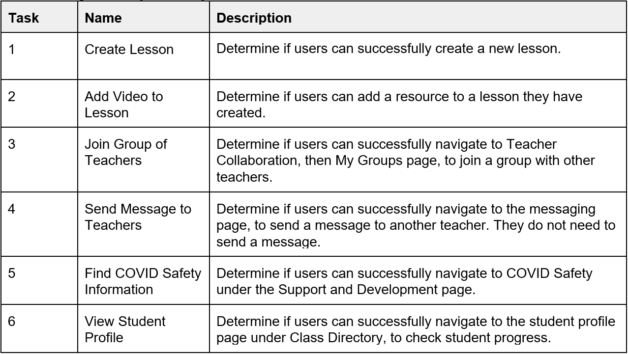
We recruited 5 K-12 educators for remote low-fidelity usability testing through personal connections. We conducted a low-fidelity prototype evaluation to identify potential usability problems our users might encounter when trying to complete tasks. This evaluation feedback allowed us to modify the prototype early in the design process, test ideas, and collect feedback on revised designs more efficiently. Participants were asked to complete 6 tasks. The table below the task list displays participant task completion results. A task was only considered complete if the participant was able to complete the full task without help from the facilitator.
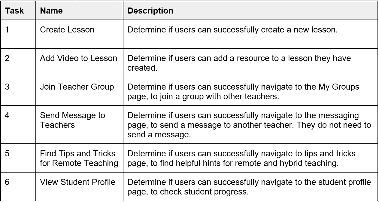
Low-fidelity Prototype Usability Testing tasks
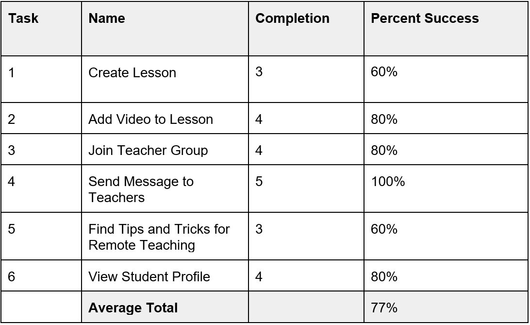
Low-fidelity Prototype Usability Testing Results
Following this testing, the group evaluated the results and feedback from low-fidelity testing participants and implemented the following changes when moving to the hi-fidelity prototype:
Type & button Size
We increased the font size to a minimum of 16 pt throughout the prototype to meet WCAG guidelines, which required us to adjust the design layout. 2 participants mentioned they could not see the links and feature text during testing. We also made the “Create a New Lesson” larger and more prominent using color so that participants would be able to more easily and quickly find this feature.
User Help option
After some of the users had difficulty initiating the Lesson Creation task, we created a help screen to guide them if they clicked on the “Need help creating a lesson” link. We placed this near the “Create a Lesson” button so it would be easy for participants to see. We also added a “verified” badge for resources in addition to the rating system to help teachers find verified resources more easily.
Increased path Choice
Because low-fi usability testing participants tried to initiate the Lesson Creation task from the Dashboard and Educational Resources in addition to the Lesson Portal, we added additional buttons and screens for the Lesson Creation task.
changed task language & built additional screen
Low-fi usability testing participants struggled with the initial task to Find Tips and Tricks for Remote Teaching. We created a more specific task for the second round of usability testing, which was Find COVID safety information. To accommodate this task change we built an additional screen for COVID resources.
High-fidelity Prototype [design & iteration]
Following low-fidelity prototype usability testing, the team developed a mood board to ideate on the branding, look, and feel of EduGREAT. Utilizing the modern, light & airy feel of the chosen branding, combined with bright pops of color to emphasize important features, as well as user feedback from the initial round of testing, the team developed the high-fidelity prototype:

High-Fidelity Prototype: Dashboard

High-fidelity Prototype: Student Profile

High-fidelity Prototype: Educational Resources

High-fidelity Prototype: Educational Resources Search Results
Key features of the system based on user feedback included:
Easy & Streamlined Lesson Planning
Teachers were utilizing many resources to create their lesson plans. They lacked a simple organization system, and several interviewees just used random folders on their personal desktop computers. EduGREAT includes an easy lesson and resource organization system to help educators stay organized and aid in the lesson planning process. Some support educators working in areas such as ELL & Special Education often needed to modify lesson plans for specific students. The system allows for easy attachment of various resources such as worksheets or videos to allow for customization. They also have the ability to share lesson plans and resources to aid in collaboration between main classroom teachers and support educators.
Integrated educational resources
Educators were obtaining materials from many different places, which is extremely time-consuming and tedious. Our system attempts to remedy this by integrating resources from different areas directly into the system. We also added a verification feature to indicate resources that have been vetted and approved by an authoritative source, as many educators also expressed frustration at not know which resources are legitimate and effective.
Educator Collaboration
One frustration for educators in supporting roles was adequate communication and collaboration with main classroom teachers. EduGREAT allows for sharing of lesson plans and resources with a simple “share” button, as well as the ability to add team members to a child’s profile, so that educators can work together to help students reach their goals. Additionally, there is an area for IEP/504 plans in each student’s profile so that educators can easily access the reports and collaborate on making sure the plan is implemented.
Some educators felt isolated, for example, one participant was the sole Special Education teacher in the entire district. We also included a collaboration area for teachers to join groups, ask and answer questions, share advice, materials and resources, and have a support system.
Development, Training, & Support
Many teachers told us about the struggles of teaching themselves how to use remote technology and programs during the pandemic. Trainings were inadequate, time was extremely limited, and many users told us they were overwhelmed and didn’t know where to look for technological support & development. In response, we included a Teacher Development area in the EduGREAT system, where educators can read tips & tricks, access technology training, obtain professional development materials, and have access to mental health resources.
High-fi usability Testing [evaluate]
We conducted 7 remote moderated usability tests with K-12 educators. Zoom enabled with screen sharing was used to view the participants interacting with the low-fidelity prototype. To evaluate the effectiveness of the prototype features through remote usability testing on the prototype with current K-12 educators, we used a testing task list of six tasks (see below). We rated each completed task as “pass” or “1” and each failed task as “fail” or “0.” We then calculated the percentage of success.
High-fidelity Usability Test Tasks
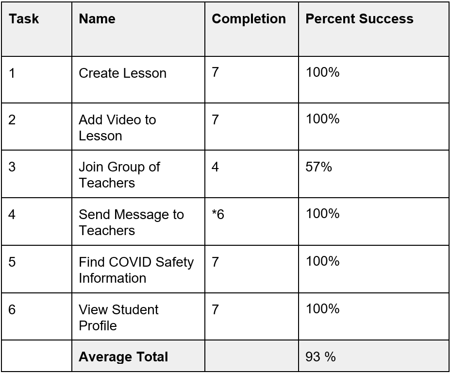
High-fidelity Usability Test Results
*One participant was unable to complete the Send a Message task due to a technical issue with her browser on her device.
In our analysis of the results, the success rate increased to 100% for the Create a Lesson and Teacher Development - COVID Safety tasks and by adding an additional quick link on the dashboard, as well as adjusting the prompts. Each of these had 60% effectiveness in the prior low-fidelity usability testing. One task that declined from an 80% to a 57% success rate was the Join a Group task. We were unsure what prompted the decline in success, but based on participant feedback we would likely place the My Groups section into the Teacher Directory where 2 of 3 participants that were unable to complete the task said they would expect to find it. All tasks except one were completed 100% successfully, which signaled that our changes from the low-fidelity to high-fidelity prototype, including additional paths and clearer task focus, helped the users complete the tasks.
The average successful task completion rates increased from 77% in the low-fidelity usability testing to 93% in the high-fidelity usability testing.
Reflection
Project limitations
There were several limitations to our work on EduGREAT. COVID was a factor, because it limited our interviews exclusively to remote Zoom interviews. It also affected the availability of some of our interview and usability participants, which made scheduling them more difficult. In addition, our participants were all K-12 remote or hybrid educators, so they are under a tremendous amount of stress. They often interacted with us at the end of a full day of teaching, which may have impacted some of their interview responses and usability testing results. The relatively short ten week timeline of this project was another limitation, which forced us to prioritize our efforts. Finally, all of our interviewees and usability testing participants were personal connections. While we would have preferred to utilize participants that we did not know, given our participant criteria and time limitations, using acquaintances was our only viable option. Our connection to participants could have positively biased some of their responses, as we noted above in relation to our goals. In addition, the majority of our interviewees were female, which means there could be a gender bias.
Future considerations
For future work, we would like to explore the student and guardian facing side of the platform, so that we can better understand and build the holistic Toolkit experience for all potential users. Our future work may include additional research on existing platforms that guardians and students are currently interacting with, to help us assess the challenges, successful features, and limitations of these. We would also like to interview guardians and students to determine their goals, challenges, and needs as they relate to remote educational platforms. These additional research methods would help us gather key insights and implement potential solutions for the guardian and student facing side of the EduGREAT Toolkit. Finally, we would refine our high-fidelity prototype so that it includes additional features such as Zoom integration, ability to upload additional resources, and incorporating student feedback. Once these design changes were implemented, we would evaluate these additional features with a usability test, then further refine it as needed.