Ontario Parks IA Redesign

objective
The objective of this project is to assess the information and information architecture on the site for Ontario Parks, and utilize findings to suggest IA and design improvements. The repetitive nature of the current site information and navigation adds confusion and could benefit from analysis and restructuring. There is a disorganized additional navigation in the footer, as well as main navigation items such as the Park Store, which should be streamlined into the existing site.
Context
Graduate project completed for HCI454: IX Design & Information Architecture at DePaul University
TEAMMATES:
Rahul Kapoor
METHODS & TOOLS:
Content Inventory, Optimal Card Sort/Treejack/Chalkmark Testing, Adobe XD
role:
IA Testing & Design, UX Design [special focus on the “Booking an Event” Task Scenario"]
Content inventory [discover]
For this project, we focused on the primary and secondary navigation. The content inventory showed us many navigation items, which should be housed under the main category but were not. Some problems the content inventory brought up:
#1 Complicated structure & inaccessible information
The current structure is complex, with many subcategory navigation items, which make it difficult for users to access the information they are looking for.
#2 Duplicate Items
There were several unnecessary duplicate navigation items (Parks, and Park Locator) which might cause confusion.
#3 Footer Navigation
The footer navigation was expansive with some unclear verbiage such as “Planning”.
#4 Hidden Nested Navigation
Important information such as activity info, or events, was nested deeper in the navigation, and was challenging to get to, requiring lots of clicking and searching to find those items.
#5 External Navigation Items
The “Parks Store” navigation item was external, and only sold one thing (permit), this should be streamlined into the existing site to assist users in accomplishing their goals and navigating the site.
The content inventory helped us with recognizing the changes needed to simplify and clarify the navigation. Redundant information needed to be combined, and information buried in nested navigation needed to be made accessible and clear to get to.
personas & Use Scenarios [define]
We began with creating two personas covering a broad experience range — including casual, novice users, as well as experts. We tried to make the website’s navigation quick to use, for our infrequent users and assist sophisticated outdoor enthusiasts to access the information they required.
CARD SORTs [IDEATE]
After the content inventory was complete, we created 6 overarching categories informed by the content found on the current site. We conducted 2 additional card sorts to 1) correct problem areas which participants disagreed on, were found to be problem cards, or were deemed unclear or confusing in post-sort feedback and 2) to validate results from the previous sorts.
Card sort 1: Hybrid sort [5 participants]
30 cards | 6 categories:
camp
explore park activities
get involved
learn about ontario parks
master the outdoors
plan your visit
What we learned from card sort 1:
• Users got confused because there were too many unclear categories which many cards could fall into. For example, “discover must-see sites” was put into “Learn about Ontario Parks, “Plan Your Visit” and “Explore Park Activities”. There were many items like this, so we knew we had to a) rename the categories, and b) combine some of them for clarity.
• We meant for “Master the Outdoors” to be a learning center housing courses and programs, but the users did not understand the wording so we decided to eliminate this category.
• We meant for “Learn About Ontario Parks” to house the science/research portion, however, users understood that more generally and it overlapped with the same information we meant for “Plan Your Visit”.
Overall, we needed to merge categories and simplify titles. We also forgot to include the integral “Not Sure” category.
card sort 2: closed sort [6 participants
30 cards | 6 categories:
camp
explore park conservation & research
get involved
discover park events and activities
not sure
Plan your visit
What we learned from card sort 2:
• After merging the categories, we still noticed users were having challenges with “Camp” vs “Plan Your Visit” and there was too much overlap and confusion. We had a tie in our results, and so we had to go ahead and do another card sort to confirm our hypothesis and make the appropriate changes.
• We also came across an issue due to a lack of an “About Us” category. Many users placed cards like “meet the team” into “Not Sure” since there was no clear place for this type of information.
After this second card sort, we decided to eliminate “Camp” as its own main category, and house camping information under “Discover Park Events and Activities”. We also added the category “Learn About Us” to house information such as job opportunities, the board of directors, corporate partners, and FAQs.
Card sort 3: hybrid sort [5 participants]
30 cards | 6 categories:
Learn about us
explore park conservation & research
Get Involved
Discover Park Events and Activities
not sure
Plan your visit
What we learned from card sort 3:
• In general, the third card sort went slightly better, however we made an error by keeping it a “hybrid” card sort so late in the game, which gave the users options to create new buckets. This distorted our findings.
• It would have also been helpful to have more people do the card sort — we only had 5 participants due to time restraints, so the results and validation weren’t as meaningful as we hoped.
Treejack IA Testing [IDEATE]
After the card sorts were conducted and the high level categories were established, we moved forward with Treejack testing in order to test deeper navigation paths and to test how successfully users could complete goals given a series of 7 tasks:
Imagine you are a college professor and you would like to study mushrooms at Ontario Parks. Where would you go in order to apply to conduct such research?
You and your best friend have a day off soon and would like to kayak. Where would you go to rent a kayak online?
You are planning a family vacation and read about the various accommodations being offered by Ontario Parks. Where would you go on the site to find cottages for rent?
Your friend has told you about the Learn to Camp program at Ontario Parks. You would like to get a better idea of the itinerary for the program. Where would you look to find when the program is running next?
You and your partner love the outdoors and want to support the various initiatives run by Ontario Parks. Where would you go on the site to make a donation to support the parks?
You want to take up fishing and your colleague at work told you about this great fishing 101 program offered by Ontario Parks. Where would you go in order to find a list of courses that are being offered by the parks?
Your nephew is tagging along with you on a camping trip. You want to make sure he has things to do so he enjoys the camping trip. Where would you find a list of kid-friendly activities on the site?
CLICK HERE TO SEE TREEJACK 1.0 RESULTS
CLICK HERE TO SEE TREEJACK 2.0 RESULTS
CLICK HERE TO SEE TREEJACK 3.0 RESULTS

We conducted a third round of Treejack testing, taking into account our findings from the first two rounds of testing, improving verbiage on our tasks, and replacing a few already successful tasks with a few other options to further test the IA. These were some overall insights after three rounds of Treejack testing:
#1 Keep main navigation overarching and clear
If we made the main navigation categories too vague, such as “Camp”, users had all sorts of ideas about which items belonged there. Some were looking for related events there, some were looking for cabin accommodations. It was too unclear what exactly should be housed there, and it overlapped too much with the other main navigation categories. Once we eliminated “Camp” as its own category, there was a 64% improvement in finding a “Learn to Camp” class task completion from Treejack 1 to Treejack 3, with a final 93% success rate. Success of finding a cottage for rent also improved from 71% success in Treejack 1 to 83% success in Treejack 2. We believe that category elimination mitigated confusion and helped improve clarity.
#2 Sometimes redundancy is necessary if the users prove the need for it
Users proved to take paths in the Treejack testing which we initially did not consider, but which made sense. Some things, such as “renting a kayak” logically could be found via “Discover Park Events and Activities” as well as “Plan your Visit, Equipment Rental”. After users confirmed using both logical navigation paths, we knew that they should be able to get to certain items from multiple areas.
#3 Sometimes the users will prove you completely wrong- that’s the point!
Treejack testing was very beneficial because it showed us that sometimes the designer’s intentions and mental model can be completely off! For example, we had placed Camping Tips (such as a packing list) under “Events & Activities” —> “Camping” —> “Pack Like a Pro”. Every single user went to “Plan Your Visit” first, and the task had a 73% failure rate. These types of results are really helpful because it helps you recognize what the user is thinking, and where you fall short of meeting their expectations. We made the recommendation to move that information in the final site map because of this testing.
CHALKMARK TESTING [design & evaluate]
We also conducted a brief chalkmark test in order to see how users navigated potential proposed layouts:
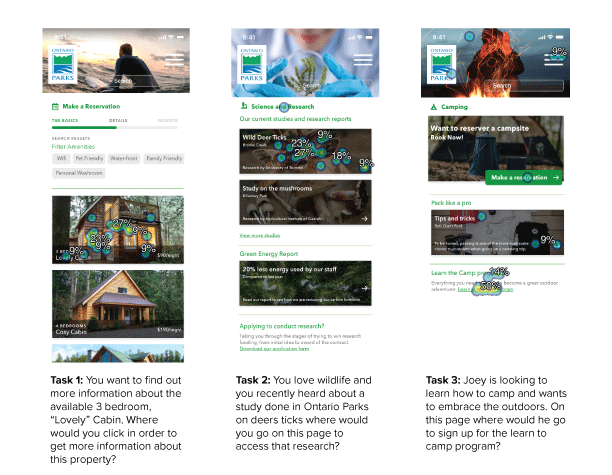
Heatmap images from Optimal Workshop post-testing
22 participants
Task 1:
Overall 95% success rate
68% of participants clicked on the image vs 27% clicking typography
Task 2:
Overall 95% success rate
One participant clicked the “Science and Research” text heading
Task 3:
Overall 64% success rate
50% clicked the link, and 14% clicked the “Learn to Camp” heading
Overall chalkmark testing findings:
• We had three tasks that were completed quite successfully, but we feel maybe our tasks were simple and too easy to execute- in the future we would have probably defined more focused tasks to evaluate.
• Majority of users clicked on image as opposed to text where there was an image/text combo.
• We learned that underlining a link works well, as all users clicked the underlined text to sign up for the program.
Prototyping [design]
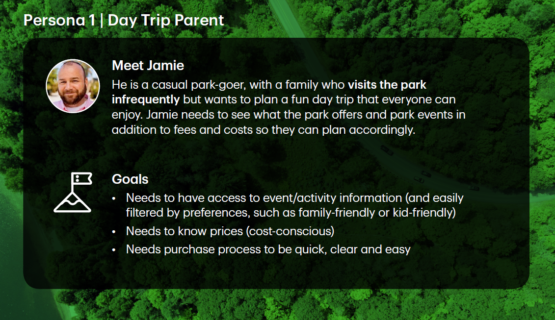
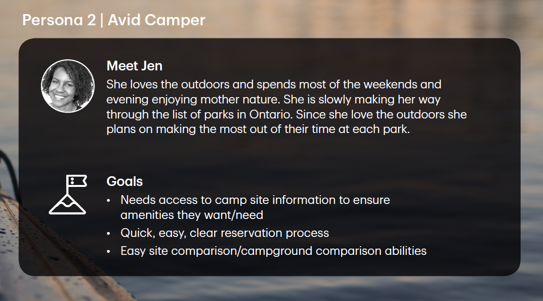
We created wireframes for two main task scenarios, designed keeping in mind the two main personas we created at the beginning of the project:
“DAY TRIP PARENT” PERSONA Task Scenario:
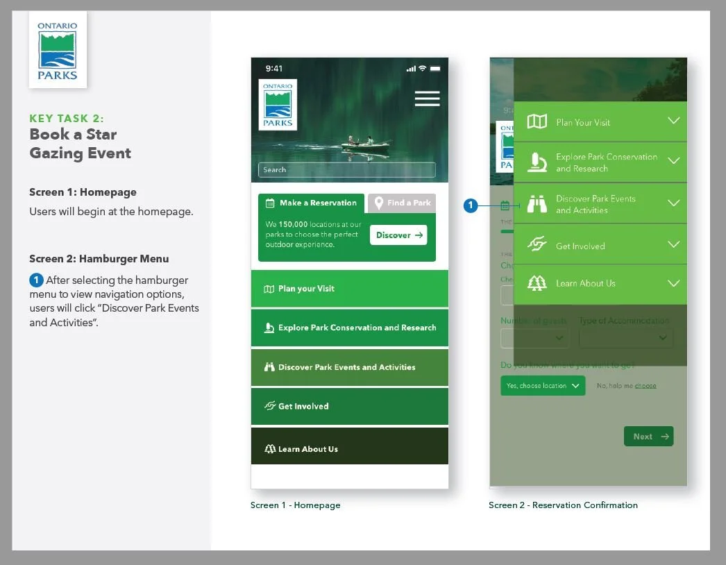
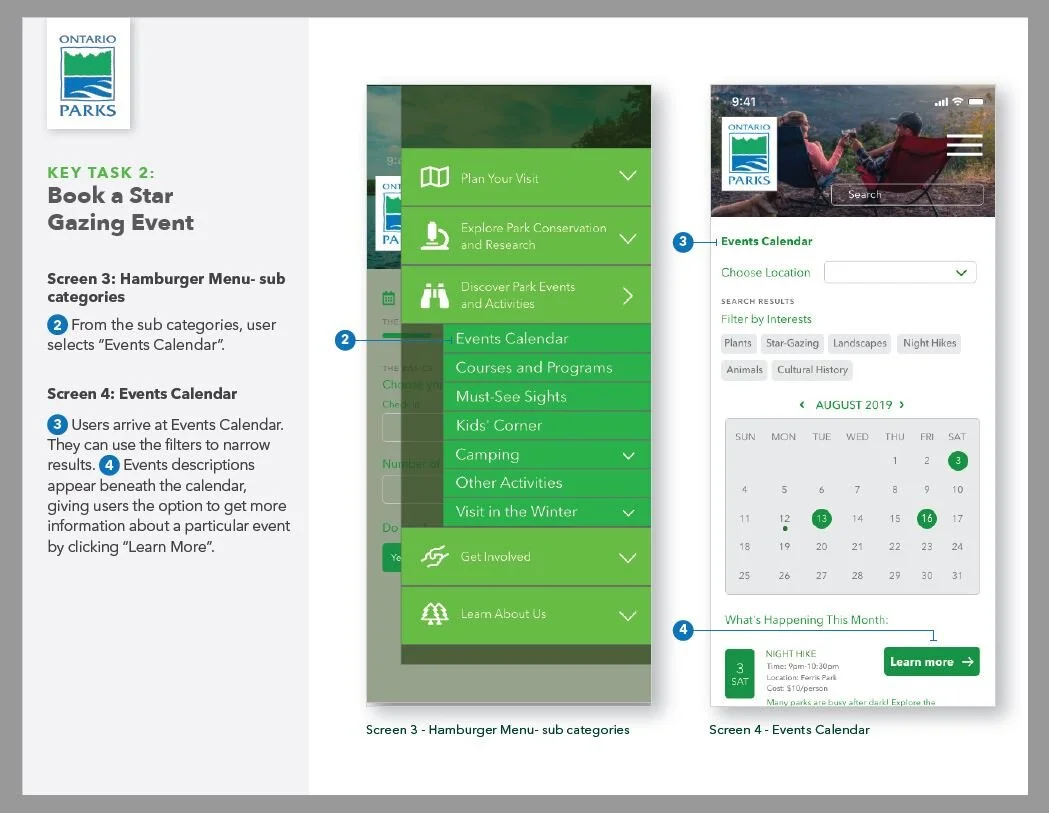
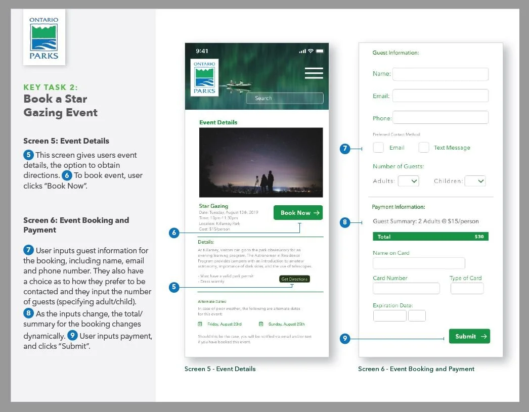
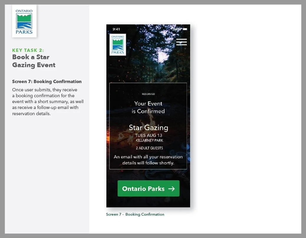
Imagine you are a parent, and your children are learning about planets and stars at school. You don’t visit parks very often, but your buddy at work just told you how great some of the events are at Ontario Parks, and how beneficial educational programs would be for your kids. You would like to surprise your kids and spouse, and take them to a star gazing event at Ontario Parks. How would you go about doing booking this event?
“AVID CAMPER” PERSONA TASK SCENARIO:
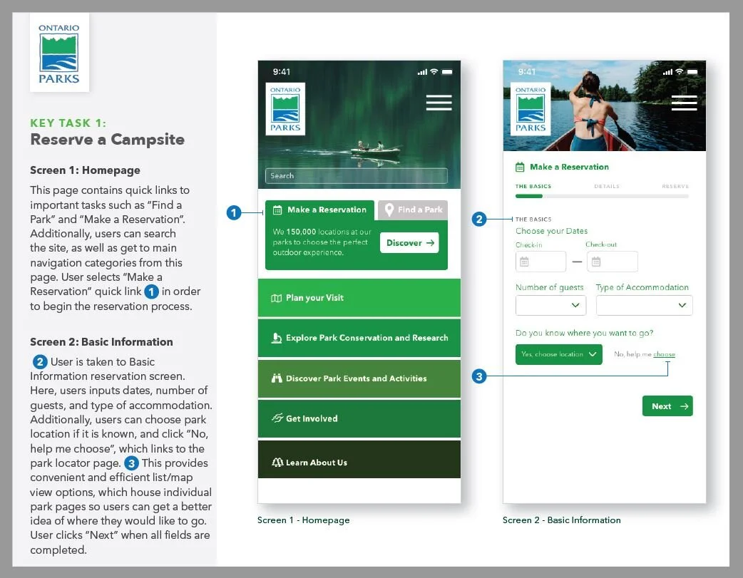
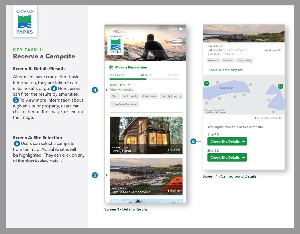
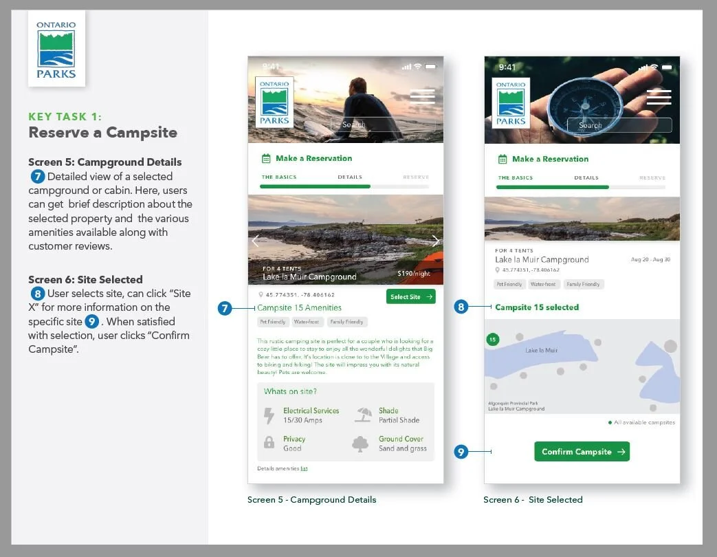
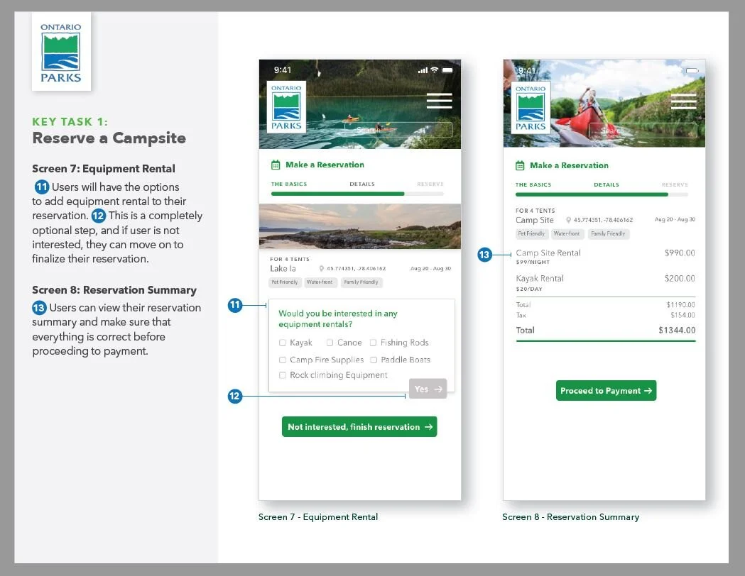
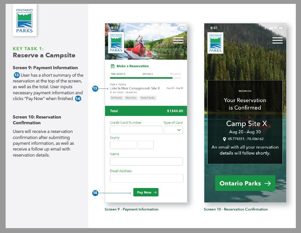
Imagine you are an experienced camper, and would like to visit the Lake la Muir Campground in Algonquin Provincial Park. You want a nice water-front camp site, and you love taking your dog, Diesel, with you so you need the site to be pet-friendly as well. How would you go about finding and reserving a campsite?
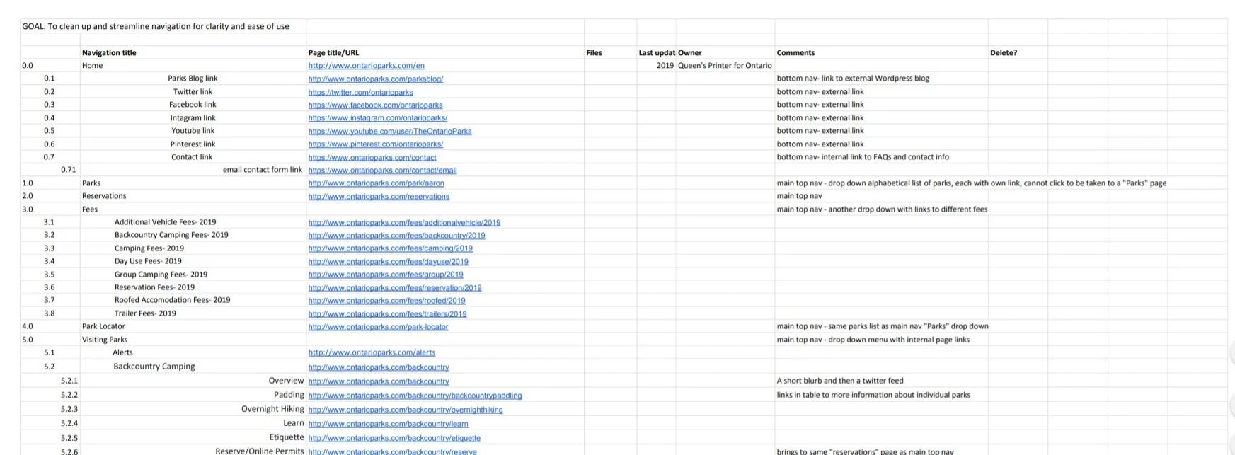
SITEMAP Revamp

Original main navigation

Proposed main navigation
Following our content inventory, card sorts, and Treejack testing, we propose the following updated site map below. This site map displays the high level categories. The proposed site map simplifies and streamlines all of the pages and information found on the Ontario Parks website:
